Friday, December 3, 2010
Index Value Plot
source
Index Value Plots are used to compare two sets of data. This can be used in many different forms. Placing the data in this manor allows us to see any discrepancies in the data.
Range Graded Proportional Circle Map
Range Graded Proportional Circle Maps are Proportional Circle Maps whos circle size have been predetermined in order to represent an average range of data. The example above show the Hispanic Population on the United States.
Continuously Variable Proportional Circle Map
Continuously Variable Proportional Circle Map is a Proportional Circle Map that specifically links the size of the circles to particular data. This is great for showing population.
Climograph
A Climograph isa weather graph used to chart monthly precipitation and temperature conditions for aa given location. Above is bar graph of Boulder, CO
Hypsometric Maps
Hypsometric Maps are maps that show elevation with shades of color. It is most commonly done with earth tones. Above is an example of a Hypsometric Map of France. Usually the darker the tone, the higher the elevation.
Thursday, December 2, 2010
Isopleth
An Isopleth is a map of Isolines that connect, in circular(ish) form, in order to show areas with similar vlaues.
Isotachs
Isotachs connect areas of equal wind speed, they are a type of Isoline, similar to Isobars. The example above shows the wind direction and speed across the United States.
Nominal Area Choropleth Map
A Nominal Area Choropleth Map does not give any particular percentagesof order information. Instead it visually shows us a summary of the data.
Univariate Choropleth Map
A Univariate Choropleth Map is basically a Choropleth Map only discussing on variable. The example shown above deals with water withdraws in the United States.
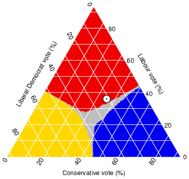
Triangle Plot

A Triangle Plot makes it possible to plot three variables against each other. There is over lap between the variables which forms the gray section in the middle.
Wednesday, December 1, 2010
Bivariate Choropleth Map
A Bivariate Choropleth map is a Classed Choropleth map that compare two sets of statistics. The map above showing the change in divorce rates, comparing a 1980's Classed Choropleth Map to and 1990s Classed Choropleth Map.
*If you go to the source of the photo the map flashes between Classed Choropleth Maps. I have provided a screencap below in order to show the other map that flashes.
Unclassed Choropleth Maps
Unclassed Choropleth Maps are extremely similar to Classed Choropleth Maps except, Unclassed Choropleth maps do not have an averaged statistic towards each particular color. There are many shades of each color to show the diversity of the statistics.
Histogram
A Histogram is a basic bar graph that we have been familiar with since early math classes. The example above shows us the statistics of Particular jockeys.
Planimetric Map
Planimetric maps use lines and symbols in order to depict a certain are. They do not include elevation. There primary purpose is for transportation lay outs.
Box Plot
A Box Plot is usually shown in the format above but I have included a second picture that clearly explains the way a box plot is drawn and understood. These graphs allow us to quickly spot the Mean and Median.
Stem and Leaf Plot
source
A Steam and Leaf plot is used to organize a set of numbers. The left column (the Stem) would be the first digit in the number and the right column (the Leaf) would be the following numbers. So the first row is a way of organizing the numbers 90 ad 96. This also allows us a clear visual as to where majority of the numbers in out set fall.
Similarity Matrix
A Similarity Matrix is similar to a Correlation Matrix but instead it uses blocks of colors in order to show correlation. One the Matrix shown above, the more red toned the square it the more correlation it has between the X and Y axis.
Subscribe to:
Posts (Atom)


